With Britain set to go through the hottest May for more than 170 years and thermometers set to top 30C, it’s time to think about preparing your printed merchandise for any festivals or events that you have coming up this year.
As the heat isn’t set to end in May, with forecasters predicting that the UK is going to go through “heatwave after heatwave” throughout June and July, hundreds of thousands of people are set to attend festivals and events throughout the summer months. For this reason, it’s important to get your designs prepared and printed, but more importantly, to make sure that the designs stand out during the biggest personalised t shirt wearing period of the calendar.
When it comes to designing T Shirts, one of the most fun parts is choosing the ink and the T-Shirt colours. As fun as it may be, though, this part of the design process isn’t without its own fair share of problems and sometimes the colour combinations that you see on your computer screen will look more vivid and more vibrant than they do in real life.
On reason for this, is because our computer screens are fitted with built-in filters which make your screens look more vibrant and while the colours may look more visually perfect, it won’t be an accurate representation of what it will look like once it’s in the printing lab.
At Garment Printing, we’re very aware of this issue and, for this reason, we use Pantone colour matching to ensure that all of the colours that we print perfectly match the colours that you’ve selected for your design. If you don’t have the Pantone reference number, then we’re able to closely match the colours to ensure that it’s as close as possible to what you want.
But, to help you decide which T-Shirt and ink colours work best, I’ve created a quick guide to run through the best possible combinations to make sure that your designs truly stand out.
LIGHT COLOURS:
When you’re using lighter coloured T Shirts, it’s important to think about not only how the T-Shirt looks up close, but also how it looks at a distance. For this reason, remember that by using pastel colours, such as yellows, light blues and light pinks, may not be legible when it’s viewed from a distance.
To avoid this issue, one quick-fix idea is to outline your design with a darker colour which will highlight the design or the text and make it easier to view from a distance.
DARK COLOURS:
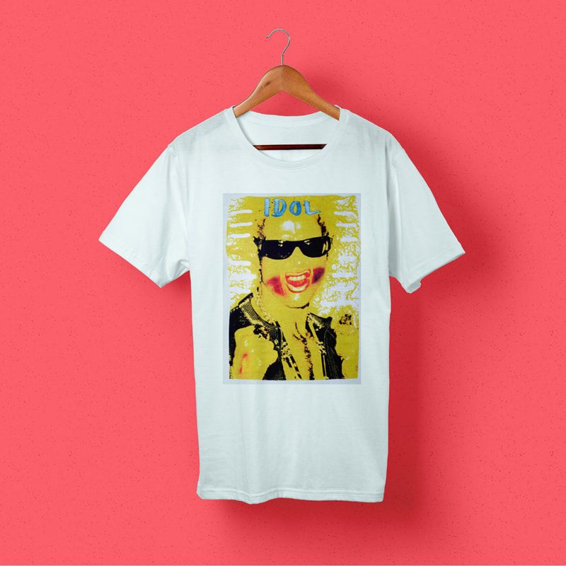
When you’re using a darker T-Shirt, using lighter colours can really make your design ‘pop’ and stand out. Similar to light inks on a light T-Shirt, though, placing a dark design over a dark T-Shirt will mean that the design gets lost and it’s not easily viewable.
These colours can include maroon, forest greens, cardinals and dark colours. The problem here is that sometimes the colour of the T-Shirt can distort the ink colour and make them look more brown or duller than was originally intended.
To avoid this, the best technique is to use lighter colour designs on darker T Shirts.
Our staff are all experts in printing and design of personalised clothing and can pick up on requests where the design won’t stand out and we can provide you with help and information about how to rectify this and make your design look exactly how you want it to.
One area where the colour of the ink and the T-Shirt can hinder the design is if you’re creating custom printed band T Shirts. This is because when you’re trying to highlight your band and show the design off to your fans and potential admirers, you want them to be able to clearly view your band name and your design easily from more of a distance.
If your design is hard to view, then people won’t be able to see the designs when you’re on stage, meaning that your design will get lost and your fans won’t be able to see the T Shirts when they’re attending your gig.
Likewise, if you’re attending or hosting a music festival and you want to create printed festival T shirts either to sell at the festival or for the volunteers or for the staff to wear, it’s important to remember that the colours of the inks and the designs that you choose can affect how the T-Shirt looks and how much it stands out.
Of course, it’s not just T shirt printing that you need to take into account when you’re creating printed merchandise for any event, with soaring temperatures you might also consider adding printed sunglasses to your lineup and again, choosing the right colours for your shades can also have a big effect. If you’re offering dark sunglasses, then it’s important to complement them with a lighter colour design to ensure that they really do stand out from the crowd.


